Oh, you're a model, whats your agency, Instagram? Bringing our black project to an end we had to generate our photoshoot imagery into pieces of promotional material. A piece of print, advert and piece of promotional material. I chose to create an Article on The hidden beauty Standards on male modelling, a fenty beauty advert and album cover. These were presented to each seminar group and we were left with the chance to add post it notes to each persons work with compliments or constructive criticism if we felt fit.
For my article I of course jumped at the chance to be conceited af and feature myself on a 2 page spread. I looked at the obvious magazines like Vogue and Dazed and also dabbled into less traditional prints like fanzines and brandzines. I loved both the traditional Vogue article spreads as well as the 'rougher' more intimate layouts of fanzines. I wanted to create a hybrid of the both and I feel that I achieved this with the typography and layout being very vogue-esque whilst choosing a more rough and 'free hand' scribble on the first page to decorate and dim, dingy and urban image to accompany this and I actually think the contrast looks really cool and makes each element pop. The subject was the hidden beauty standards of male modelling. By this I meant that everyone is allll over female beauty standards in the fashion industry explaining the pressures it has on everyday women and teenagers and how stretch marks need to be shown and much less airbrushing etc but the impact on men never seems to be brought up. The fact that every single man featured in magazines has the clearest skin, ripped abs and chiseled jaw. If I was to actually write the article it would go on to expose male beauty standards and how these need to be addressed especially in the modelling world. For this I was given two post its by my peers one saying "strong message" and the other "well presented with a clear theme".
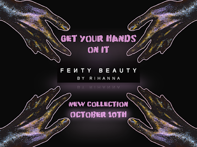
I decided to focus my advert on Bad Gal RiRi herself and promote her new Fenty Beauty makeup range. I manipulated the image of the hand seen in the previous post for this ad, I'd love to say I spent hours carefully tweaking this on photoshop but turns out clicking a few random buttons on Word accidentally achieves this look! This is my favourite outcome as I feel its perfectly on brand for Rihanna and her current campaign (that I'm in love with) and also adds an extra element that she's missing from the campaign. For this I was given post it's saying "appealing to a massively rising brand' and "works well with current brand image and could see this being in her actual campaign".
For my final outcome I created an album cover. I used the hand image as the background layered with the album title "Black on Black" and an image of the 'artist' Kay Laws on top in the centre. I looove the outcome of this due to it's current Life Of Pablo vibes and professional feel.
This has been my favourite project to date due to the complete openness of the brief we could take pictures of WHATEVER make outcomes of WHATEVER and could present them HOWEVER we wanted. I feel like the openers allowed people to really express themselves and their style and show what they wanna show to the world and their point of view. I really hope such open and expressive briefs continue.
SHAUN EVANS


No comments
Post a Comment